At its core, D3.js solves a fundamental problem (perhaps the fundamental problem) of software architecture: synchronizing state between two components of an application — dissimilar components at that. There is an impedance mismatch between the language of JavaScript code and the life of interactive HTML. D3 bridges between these two worlds of logic and presentation in a deft, efficient, and — with practice — an elegant approach.
But that's jumping ahead a bit.
D3 stands for "Data-Driven Documents". Completely correct, but basically, an alliterative anthem. What does D3 do? On its own, nothing! When the D3.js library is included in a web page, it does little more than export a collection of commonly-needed functions beneath its single global variable (d3, naturally) and wait for some other JavaScript code to make use of it. Your code will control every interaction D3 has with your data and your document. D3 favors the explicit over the implicit, and uses a minimal amount of "magic" or even hidden state to do its work — your work. Yet, as its homepage at d3js.org promises, "D3 helps you bring data to life using HTML, SVG and CSS."
D3 is unique.
It's a visualization library, but with no "chart" base class that handles all that HTML, SVG and CSS for you. In fact, it rarely does much to any part of the DOM (the interface a browser exposes for scripts to manipulate HTML, SVG and their styling) on its own; usually your code ends up directly responsible for adding in low-level elements and setting raw attributes to build the underlying markup that, when rendered by the browser, will display the data. D3 is a visualization library that uses DOM manipulation as its graphics library.
It's a DOM manipulation library, but with no shorthand for something as useful as toggling an element's style to an opposite state. It doesn't provide a way to move a child node from one parent to another, or to calculate the displayed dimensions of an element, and overall it's even very stingy with "cross-browser compatibility" code to support older or broken user agents. D3 is a DOM manipulation library that leaves the fancy "document object modelling" stuff to the DOM itself (which has gained a lot of standardized luxuries in recent years).
It's even something of a web templating language, even though it doesn't really separate code from markup at all — quite the opposite in fact! By borrowing heavily from functional programming concepts, it manages to make imperative code look declarative: you write step-by-step instructions for modifying a document, but those instructions can be read almost as a pattern of the desired result. D3 is not a web templating language, but should feel sort of like one when used properly.
What D3 doesn't do is leave you outside a black box, or hand you a big hunk of molded plastic with maybe a few poseable limbs and a couple sound effect buttons. D3 isn't a packaged product, it's a toolchest. Everything it doesn't do would be unfortunate if D3 was something like a plastic model kit or puzzle. That is, if there were only one correct way to assemble things, it would hardly be appropriate to leave that work to each of the library's users. But there are many correct ways to assemble the pieces D3.js provides. In this sense, D3 is most like a construction set where there are so many combinations of pieces. Imagination and creativity soon become more valuable than following instructions!
Here are three ways of visualizing the exact same data set:
The first is just a plain view of the data, a list of the six chemicals which serve as the primary building blocks of most living organisms. The second is a simple graph of how many letters are in each of their names. The third counts the frequency of each letter through the whole dataset, and displays the resulting statistics.
If we had more useful data than just a list of names — if, say, for every chemical element we also had recorded its unique number of protons — we could perform more useful visual variations. We could arrange or graph them according to this more meaningful number, or even arrange the elements not only in correct order but also so the visual distance between each was proportional to the difference in atomic number. There are countless ways of displaying even the simplest data, and D3 is able to help with any, no matter how unexpected it would be.
Code is a living thing too, though, so food provides an even better analogy than construction sets or nutrient building blocks. To visualize something, we start with the reality and harvest (or butcher, as the case may be) its data. From all the information in a particular field — simple facts like a company's cashflow or how many listeners are downloading a new music sampler, or more complex realities like a department's morale or a graph of other artists similar to a particular band — concrete numbers, classifications and relationships get separated out and packaged up into a "data model".
This data model becomes the main ingredient in a meal for the eyes; the data drives the displayed result. D3.js is "merely" the kitchen in which the meal is prepared! It provides spatulas, mixers, pastry tubes, an oven timer, pots and pans and pestles: tools that help request data from the server, that help form it into desired shapes, that help add flavor or garnish, that coordinate presenting fresh courses at their proper time, and that hold everything together as the meal is prepared. Via a consistently arranged (and relatively small) clientside JavaScript library, D3.js provides all the tools commonly needed to make raw data visible.
At first, unfortunately, the task of designing a complex visualization using only a few empty pans, some simple utensils, and which of those large appliances on the counter? can be daunting. Don't worry — this feeling will pass.
Think of this book not as sitting down to sample a master chef's modern cuisine, but rather an invitation to lurk in a farmhouse kitchen where everyday meals are made, every day. You'll soon feel right at home. Once you understand the equipment in the cupboard, you'll start recognizing its effects on the raw ingredients. When you sit down at a fancier feast, you'll be able to see the raw ingredients which went into it, and have a good idea of what it would take to get them to the table yourself. Every chart worth digesting was generated from some sort of raw source data, sometimes with a lot of added garnish, sometimes with a novel culinary technique, but usually cooked up using only a few common tricks.
Soon enough, feeling overwhelmed will be replaced with imagination: first imagining the data that went into the next interesting chart you encounter, then imagining the hidden logic that transformed it into that particular visualization, then imagining how you might do something similar with your own harvest of data. This book is not a recipe book — there are too many delicious dishes to list, and even more that still are waiting to be discovered. This book is about showing how each of D3's tools work on their own, then showing how these pieces are usually used together as a whole.
You'll likely notice patterns, reused and remixed and even repurposed. D3 doesn't provide many "cookie cutters", but it does tend towards certain repeated motions which can slice and dice anything — not just stamping out some same old graph with only different data. Its components are naturally applied to totally new types of visualization and interaction. D3 handles maps and even apps as well as it handles interactive charts — and it does handle charts very well.
In the biochemistry example above, each of the three ways of making data visible uses D3 in about the same way; when preparing them I literally copy-pasted the code for the first and made only a few "minor" code changes for the next two. At a glance, the lines of code look very similar, while the results on screen are very distinct. By learning to see the patterns (the similarities in how every visualization is made) you will also begin to quickly understand the differences as well.
D3 is a relatively simple library, and we'll start simply too. We will not even worry about graphics (i.e. using SVG) until the next chapter, once we've learned a few fundamentals first. We can make raw data visible with only HTML and CSS, so we'll start by looking at D3's DOM manipulating and web templating aspects without the usual full-color graphical visualization aspect. Let's see some code bring D3's inert building blocks to life!
The foundation of D3 is a selection of elements:
d3.selectAll('.macronutrient');
This returns an Array of all elements matching the given CSS selector, i.e. any element in the page with a "macronutrient" class set. While they're always available, we don't usually use the JavaScript Array methods to loop through these elements. Instead, D3 provides its own operators on every selection:
d3.selectAll('.macronutrient').style('color', "cyan");
If you've used other DOM wrapper libraries, this probably looks familiar. Being able to apply operators to selections is handy, but it's not AMAZINGLY AWESOME and it's certainly not unique. All we've done so far is document manipulation, we haven't used data to drive it!
d3.selectAll('.macronutrient').data(macronutrients).style('color', function (nutrient) { return nutrient.color; });
TBD: continue on, maybe keep folding more ideas from next paragraph into more direct "hands-on" beginning above
There are really only two core interactions that make this all work: bound selections and a few basic code-controlled operators applied upon them. These are the matter and energy, respectively, of D3's universe. Or, to use an even better analogy from a slightly higher realm, they are the raw amino acids plus the DNA which together can form proteins, which can then build cells, which may form entire systems and ecosystems. Biology has discovered that only six major chemical elements (and little doses of a dozen or so micronutrients) compose any living thing — from a prokaryote to a plant to a person. Similarly, there are only a few core methods for working with D3 selections, but the different designs recorded in our operator logic will flower into a myriad of results.
We've seen that D3 makes it easy to manipulate elements within document's object model to make them match data input, and we've said that D3's core patterns are applicable to a wide range of uses. It's time we proved that.
It's also time to tackle what D3 is most famous for: graphs and charts!
Surprisingly, statistical graphics are barely older than a few centuries. Like our recent decade's acceptance of using a computer's Graphics Processing Unit for calculations that have little to do with displaying shaded surfaces on a monitor, pictures and diagrams (which had long been used to communicate more obviously "graphical" information like mugshots and maps and math) suddenly became an option for general purpose information presentation.
Can you tell what the two number series below represent? What's the difference between them?
| Left | Right |
|---|
It could be easier! Let's take the exact same data, but instead of writing out the figures, we'll plot the numbers in a graph. The numbers in the left hand column are drawn using a dashed line below. They represent a sine wave. The solid line is from the right hand column, a triangle wave. See?
Showing data as pictures engages the human visual system's power for more abstract purposes. We can instantly tell the difference between, say, a sharp curve and a smooth one, without hardly "thinking". We just see it. Instead of using the eye only as a sort of numeric siphon, blindly pumping individual facts between the paper where they've all been remembered and the brain where a few of them can be compared, a graph engages the eye itself in analyzing the whole set of data it represents.
A chart feels completely different than a list or table filled with numbers, but to draw one using D3, we can start by building off what we already know. Now, there are many ways of showing data visually; the examples provided here are meant to show the "how" and not necessarily the "why" of a particular chart type. You may think of better ways to show some particular data, and that's great! Hopefully by seeing how some more basic, perhaps even unglamorous (or worse — unsophisticated!) graphs and charts are assembled from both fundamental and more specialized components, you'll be able to apply those patterns in more novel (and certainly more polished) ways.
Essentially all the tools available to a graphics illustrator and nearly any algorithm available in sophisticated data analysis packages are within reach, for use togehter, when using D3! Its unique design allows full control over the recipe for a given chart, letting you combine whatever ingredients are necessary for your particular visualization. Covering all the drawing features available within browsers and all the statistical and computational geometry algorithms that have been ported to JavaScript is beyond the scope of this book, but rest assured that D3 itself uses enough of both to whet our appetites for what's possible. We'll start with the drawing features and then start adding in some of the algorithms that come bundled with D3.
We've been focusing on manipulating HTML's DOM. This DOM exposes the visible document as a tree of elements of varying types, each with its own meaning and each accepting attributes which we can use to modify how they are presented. Our options for presentation and styling these HTML elements leave a little to be desired, especially when it comes to drawing graphics content.
Fortunately, modern browsers expose another standardized DOM — one tailored specifically to the display of vector graphics! SVG, which stands for "Scalable Vector Graphics", is an XML image format (dating back to when XML was still young) for which browsers gradually added support — first via foreign object tags, then within standard img tags and finally embedded directly in HTML5 via the svg tag. It's this last milestone that is useful to us.
Manipulating SVG tags directly embedded in HTML is hardly any different than manipulating HTML itself: we use D3 to generate a selection of elements and then set attributes on these elements, using each element to display whatever information in whichever way we desire. To do this effectively we'll first summarize some basic SVG usage, but soon, finally, we will be poised to venture outside of D3's core selection API, and begin borrowing from its fantastic toolchest full of useful utilities.
If you're already familar with vector graphics, either from other drawing frameworks or even from sketching shapes in an illustration app, great! SVG follows a pretty standard vector drawing model, built on the notion of shapes drawn relative to an invisible, adjustable grid of layers, over top any "earlier" shapes drawn below. In SVG, these vector shapes are called paths, and the layered grids in which the virtual brush moves are called viewports.
Paths can be filled and/or simply left as stroked lines or outlines, and of course things like the colors used and the stroke and fills styles applied are all adjustable. SVG supports transparent colors, as well as even more advanced ways of combining (or "blending") colors with the content below. A more detailed explanation is beyond the scope of this chapter [TBD: appendix? actually I'm wondering if most of this content already belongs to such an appendix!] but here is a summary of how the elements and attributes of SVG determine what will be drawn in the document:
| SVG element | Details | Summary |
|---|---|---|
| rect |
| TBD: diagrams |
| image |
| |
| circle |
| |
| ellipse |
| |
| line |
| |
| polyline, polygon |
NOTE: the shape utilities provided by D3.js generate data for the path element instead.
| |
| text |
text element will be rendered on the image.NOTE: although we won't use much of it, this element is not nearly so simple as presented here. Through this and other related elements, SVG offers rich text features such as links, individually stylable spans, and even rendering characters along a curved baseline controlled by an arbitrary path. | |
| path |
| |
| g |
|
There are a few more elements and a lot more attributes than are listed here, but these are what we'll be using to get started showing data with SVG. We'll also be using these major presentation attributes, which can be used with any of the shape elements above:
(Of special note is that many of these presentation attributes are defined as styling properties too! This means that visual aspects can be controlled through attributes on each element, and applied as rules by CSS selectors just like would be used with HTML. That is, one could request orange outlines for all SVG circles which have a "warning" class set by including circle.warning { stroke: orange; } in one of the containing document's CSS stylesheets!)
An SVG path is its most powerful primitive. In fact, except for images and (it could be argued) text, all of these other shapes can be represented as path data instead.
What is a path? Well, a path's data is a series of instructions controlling a virtual pen. This pen can be picked up and moved, directed to move straight to another location, and/or told to follow a variety of curved traces. When a series of lines or curves ends right where it started, it is considered a closed path, and depending on either its direction of travel (fill-rule=nonzero winding) or the number of closed paths surrounding it (fill-rule=evenodd), a closed subpath can represent a filled area or an unfilled hole in another shape.
Here are some example path data strings with brief interpretations. D3 will normally generate these strings for us, so just a basic understanding will suffice. The basic rules are:
d" attribute only control the outline of the path. They determine what shape will be drawn. Other attributes (color, fill-rule, stroke-width, opacity, etc.) or corresponding CSS styling properties must still be used to control other aspects of how the shape is rendered.
<path d="…"/> | Prose | Picture |
|---|---|---|
| M 10,25 L 90,75 |
Move to (i.e. start at) top left. Draw a line towards the bottom left. This is equivalent to <line x1=10 y1=25 x2=90 y2=75/>.
| |
| M 10,25 l 0,50 l 80,0 l 0,-50 Z |
Move to top left. Draw a line downwards. Draw a line to the right. Draw a line upwards. Close the path (i.e. draw a straight line to start). This is equivalent to <rect x=10 y=25 w=80 h=50/>.
| |
| M 50,50 m -45,0 a 45,35 0 1,1 90,0 45,35 0 1,1 -90,0 |
Start in the middle, then move towards the left edge from there. Take a wide, unroated ellipse and fit a major, clockwise arc from it between the current point and a point way over to the right; then an arc from the same size ellipse, but end way over to the left. This is equivalent to <ellipse x=50 y=50 rx=45 ry=35/>.
| |
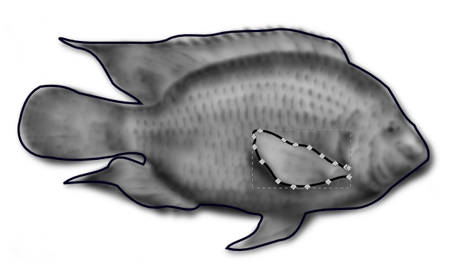
| M 50,50 l -45,-45 l 0,90 L 50,50 l 45,-45 l 0,90 Z m 0,-25 t -10,25 10,25 10,-25 -10,-25 |
Start in the middle. Draw a line towards the top left. Line straight down. Line to the middle. Line towards the top right. Line straight down. Close this subpath. Start the next subpath a little closer the top. Draw a curve down leftwards, then down rightwards, then up rightwards, then up leftwards. (An upset fish?) Note: this is filled evenodd, i.e. every other region is left "outside" the shape.
|
TBD: explain groups/transforms (incl.: elaborate on how "all elements can be transformed")
So then! We took the kernel of D3 and watched it sprout in the previous chapter, and we've just survived (presumably…) our first look over the landscape of SVG. Now let's finally start combining all these basic elements into more significant structures.
So let's take a look, finally, at basic drawing of some simple data. We'll learn how to assemble some of the patterns — several of which we've already seen! — that are looking beneath every visualization, and start getting introduced to the full D3 toolbox. It took a lot to get here; but now we have a good solid root system we can tap into as we seek to blossom out.
Say I need a simple graph to show the change in nitrate (NO3−) readings taken from a fish tank of mine over a few months. (Nitrates are unwanted in drinking water, but it's a relatively safe form of nitrogen for fish and a great fertilizer for plants — so in our case moderately elevated levels are great!) To get a feel for the general trends, it should be easy to generate a sort of "sparkline" from a sampling of data we have in an array, e.g. waterTests = [{"NO3":10}, {"NO3":10}, {"NO3":20}, {"NO3":15}, …].
A real sparkline would be a word-sized line graph, but we'll draw it below using dots, and in enlarged form, for simplicity and clarity right now. Our real focus is on the underlying pattern. For each data point we want a dot, that is, an SVG circle whose center corresponds in the horizontal (x) axis to it order in the data set and in the vertical (y) axis to the value of each data point's NO3 property. The radius and other visual properties of the dots are not derived from the data, they are just suitable constants.
That's really all there is to it, and so we mostly need to bind our data to a selection within our SVG element, append our dot elements, and then apply each datum's index to the cx attribute, and each datum's .NO3 property to the cy attribute of these dots. To keep it just about that simple, we'll first set up the image's view box so the raw index and nitrate values land in the right visual range:
We've done it!
…but there's a lot not to love about how we did it. It's simple, yes, but for starters: what happened to our circle element? Instead we've had to draw a really tall ellipse that gets squished back roughly into shape again by our stretched view box. We also had to root our view box in a negative range, and flip all our nitrate values as we drew them, so that higher values would show up higher in the page. (Remember that SVG's coordinate system is like that of many other image systems: its orgin is in the top-left instead of the bottom-left most charts use. And we can't use a negative viewbox height to flip it either — that value must be a positive number, restricting it to a simple stretchable crop box.)
This is already less than ideal, and we started with only a very simple drawing goal. Now, we've mentioned early that in addition to the image view box, SVG allows a transform to be set on any element. A transform would let us flip the coordinate system — eliminating the need to negate our cy values — but it wouldn't help our "circle squishing" problems. What really need sometimes is to convert our data before we apply it to our drawing elements. As we'll soon find, getting into this habit of transforming data as we apply it to our DOM makes things like drawing lines much much easier too.
But to do this without littering our data operator code with inscrutable equations like "return 65 - 0.5 * d.N03", we need to go beyond D3's basic DOM manipulation operators. For starters, it'd be nice if we could easily fit the data to a more natural (and more square!) view box, instead of trying to warp the view box to our data. And if we're going to trace in a line to connect each of our data points, it'd sure be great if we didn't have to build the attribute strings ourselves.
Fortunately, D3 includes tools to make both of these more natural. To fit our data to the view box, we can transform it using a scale right within our attribute operator. Once we've done that, we can even start using shape generators to yield path data on our behalf.
What is a scale?
Well, in D3.js a scale transforms numbers — meaning it can takes a value in and outputs a different, converted value. In this sense it's really just a pure function, and indeed D3's scale "instances" end up being just JavaScript functions.
D3 includes a handful of scales, in a couple different categories. Most of them take a number (or something easily converted to a number, such as a date converted to the number of seconds since the epoch) as input and output a proportional number in its place. These are called "quantitative" scales, and one of these is what we will soon use for our nitrate graph. The other, called the "ordinal" scale, can be useful for applying pre-set styles to both ordinal (i.e. values which can be ordered but no relative distances measured between them) and nominal (values which represent names or qualities) data; this data is usually non-numeric. A few of D3's quantitative scales can yield non-numeric output as well.
Let's start with what might be one of the simplest quantitative scales, d3.scale.linear() and apply it to our sparkline. We said that a scale is just a JavaScript function. This is true; when we call d3.scale.linear() we get a function back that will happily take in one value and return another. However, functions in JavaScript are also objects as well and can have properties (and therefore methods) of their own. D3 takes advantage of this to give us more readable control over the scale; instead of taking in all the parameters we're about to explore as nameless arguments on initialization, we can use setter methods on our scale function "instance" to configure it.
Let's see this in action:
Now instead of having to set up the svg image view box first, we set up our scales instead.
We've turned all sorts of data into all sorts of charts.
These charts communicate well and look great, but are probably out of date within a few trillion CPU cycles…that's what, ten minutes in human years? Oftentimes, the information you must share is constantly changing. Otherwise, if the underlying data doesn't change, why not let viewers change which data is presented to better understand the message it conveys?
It might be that you need to display a live stream of realtime information in a dashboard; it might be that a local or remote user is editing a work-in-progress dataset; it might be that you are loading data over the network in small pieces; or you may be allowing the user to select and deselect various subsets of the data. Chances are, though, at some point the visualization that's smack dab in the middle of their screen will no longer be the data the user needs to see.
There are two main aspects we need to cover in regards to data changes. The first is dealing with DOM elements that already represent data, instead of the empty slates we've been drawing into. For that we'll need to learn more about how D3 selections and data binding works — where the "entering" selection comes from and how to use the "updating" and "exiting" selection sets as well. The persistence element of the other aspect will also need an acquaintance with "relational joins" that re-match updating data items with the updating DOM.
By the time we can fully synchronize any DOM selection with the most up-to-date data, we'll already be tackling the second aspect: smoothly transitioning the DOM between its old and new states. Animated transitions can be very simple or very complex to implement; just a dozen or so characters dropped in is everything needed for many, but D3 offers a wide range of animation options and overrides which we'll cover.
Once we learn all those techniques, though, we'll conclude with a friendly reminder that JavaScript is no longer the only way to animate DOM transitions. The animation concepts we learned via D3 often can — and perhaps should! — be translated into CSS3 when targeting modern browsers, and this is no problem for the library either.
In short, this chapter explores how to handle changes "the D3 way". In the next chapter we'll see how to drive dataset changes via user interaction, and later on (in Chapter 6) we'll look at ways your higher-level code can best manage the changing state of the data it's displaying. For now, though, let's continue our focus on "drawing" what the viewer sees, properly controlling the visible results, even when the underlying data is in a state of flux.
Remember how we said D3.js makes it easy not just to create a data display, but to update an existing document with changed data?
You may have noticed a strange little dance we've done in all our charts so far. It often looks something like this:
d3.select('#container').selectAll('el.class').data(someArray)
    .enter().append('el').classed('class', true);
This seems a little repetive. We're doing one thing — adding an element with some class — but we seem to say so twice, once when we selectAll and once as we append. It seems it'd simpler, easier, if we could just say something like this instead:
d3.select('#container')
    .addData(someArray).append('el').classed('class', true);
Why does D3 make us .selectAll('el.class') within an empty element? The first time we do so, there's nobody home. We know this, and deep down inside D3 probably knows this too; it certainly finds out soon enough. We select what we're about to add anyway, because the entering selection — all we've been using so far — is only the beginning.
As a matter of fact, in most of our examples it would have worked just as well to bind a data array to .select('#emptyContainer').select('santa-claus') — doing so would have had the exact same effect, and we could still append whatever real elements we needed for the entering selection. As soon as we have selected elements or the lack thereof, D3 forgets what selector string (or function!) generated that selection. It will happily insert whatever we later ask it to, regardless if what we add matches the original selector.
The reason we provide a matching selector for those elements we're about to add, is that it's the first step to updating these same elements should the data change later. As we create child elements for the .enter() selection, D3 binds the data to them and folds each newly created data–DOM molecule into the updating selection. The updating selection is just the "main" selection, the one the chained method calls were returning before we asked for the entering selection. If we keep a reference to the updating selection we can use it to…well… update the corresponding elements!
When we appended missing elements, D3 didn't care what the original selection was that yielded them missing; likewise when we make this selection anew D3 doesn't care where its non–missing elements originally came from either. Any elements already in the DOM simply get paired with the bound data, start off already in the main updating selection, and make that much less work for the entering selection.
Becaue of this, when our sample code runs, the existing <li> is actually preserved (as seen by its special style). It doesn't get recreated each time. It starts out as the only element in the main selection. There are two items in the array but only this one element, so after binding the array as that selection's data, the enter set must insert one new element. Then (at least, ever since v2.0 of the D3.js library) it folds the appended element in to the main selection. Finally, all elements are updated so their text content matches the provided data.
Should the selector result in more elements than bound data items, these go into a special exiting set:
We didn't have to remove the extra element, we could have applied any other operator (such as .text('x_x') — soon we'll see more practical cases) just as well.
In general, it's idiomatic to handle all three selection sets as follows:
var selection = d3.select(container).selectAll('child');
selection.enter().append('child').operator('key', STATIC_VALUE);
selection.operator('key', function (dynamic) { return dynamic.value; })
selection.exit().remove();
First we add what's missing, then we update what's there, then we clean up what shouldn't be. By following this general pattern, even when it's not immediately necessary, we lay the groundwork for reusable charts. Any "extra" work, e.g. handling an exit selection for we assume will never go missing, has relatively little overhead unless it becomes necessary, perhaps later in your code's development lifecyle.
Let's go back to our humble pie chart from the last chapter. We've wrapped all the drawing code in a function, so we could apply it more than once, but it's otherwise identical:
This chart shows the amount of time spent on various activities in a day. For each sample data item, we simply append the SVG <path> element which will represent the item visually, then set the element's properties with whatever segments are necesary to draw it. This, however, doesn't support changing the visual representation when the data changes. If we change the data and run this code again, what will happen? D3 will join the changed data with the result of .selectAll('path'), which we see now involves dividing the selection into its three sets: the entering set (missing elements), the updating set (elements already present), and the exiting set (extra elements).
If we only handle the entering part of our selection, new elements will display as intended the first time but then will never change! This code will only work with additional data, not with revised or removed data. Of course, with something like a pie chart where the data always needs to fit within the same space (that whole "only 24 hours in a day" thing in this case), it'd be rather difficult to add data without revising the rest — if we spend time on a new activity we'll need to spend less time on at least one of the others. So our code right now isn't gonna work. Let's fix that.
Each day is different, and so we'd like to show the changes in various activities performed, and how much time spent on each, from day to day. Here's how we need to write our drawChart() function so it works properly when called multiple times, regardless of how the data changes in between calls:
Now whenever we call our drawChart() function, it correctly handles new, modified, and removed data items. We can now handle any reasonable change to our underlying daily time usage dataset, just by reapplying our function!
Here's what we had to change to make our chart update properly:
This achieves the immediate goal. Whenver the data changes we are able to update the DOM accordingly, and the viewer can always see the correct data.
Well…sort of. In practice, it's really hard to actually see which data changed, and how. It just flashes to its new state! To our eyes, the visualization sort of vanishes and sort of was always there. Any sense of continuity is shattered dramatic pause — in the blink of an eye.
[illustrated frames of an eye closing/opening animation (perhaps annotated with some round underlying "tweened" data?)]
It would be much easier for our eyes to grasp what's happening if the visual change mimics a more physical change. To accomplish this, we will animate the change — we will cause the browser to rapidly display intermediate states of our visualization as if it were transitioning from the original to the modified presentation.
To the eye, this will communicate motion. This motion helps the viewer better comprehend the change; just as a visualization aids spatial interpretation of numeric data, animation adds a kinetic understanding of quantitative or qualitative change. In the case of our pie chart, we would get a better sense of how much a particular activity varied from day to day if we could watch it grow or shrink.
Animation has an aesthetic aspect, too, just as static visualization does. One academic study of "Animated Transitions in Statistical Data Graphics" (Heer 2007) concluded subjects "felt that [animation] facilitated both improved understanding and increased engagement." There were more scientific results to their study of course, but these feelings matter too. A chart can be beautiful; a transition can be fun!
As you might have come to expect, with D3 there is a succint but powerful way to animate a DOM change. Simply apply the .transition() operator to any selection to yield some very useful specialized behaviour:
  // in drawChart…
  boundSelection.transition().attr('d', generator).attr('fill', function (d,i) { return scale(i); });
Adding this method call does two things: it starts a clock ticking, and it returns a selection wrapped with transition-savvy replacements for all the usual attr/property/style/… operators plus some new ones which we'll see soon.
Instead of setting the elements' d and fill attributes to the provided values immediately, these operators now simply store the desired target state internally and return control to your code. In the background, the transition operator's clock (a d3.timer(), to be specific) is ready to fire at animation-rate intervals. On every tick, the transition's internal methods will update the respective DOM state to an interpolated value between its original and the target setting for that animation frame.
Interpolation in D3 is actually very simple: the default interpolator simply looks looks for any number(s) in the current and target values and steps between them. There are a few simple ways to adjust how the animation progresses. A transitioning selection adds .delay(…) and .duration(…) operators which both take a millisecond value as their only parameter. There is also an .ease(…) parameter that allows customizing the animation timing curve, for example passing the shortcut string "cubic-in-out" will essentially "fade" the animation's speed as it starts and finishes.
The default interpolation works surprisingly well for a variety of situations: it can even do a servicable job of warping from one complete set of SVG path vertices to another, as we see in this pie chart example. If the default interpolation is not capable enough, you can actually pass customized interpolators to additional transition operators (.attrTween() and .styleTween() or even the raw .tween() operator. We'll dive deeper into this later in the chapter.
Note that in all cases the target value is calculated immediately. That is, before the call to .transition().someOperator(someFunctionValue) returns, your someFunctionValue will have already been used to decide the target values for all elements. If the underlying data changes while the transition timer is causing redraw events, this will not effect what the user sees — unless of course you apply a replacement transition by e.g. calling our drawChart() code again. This case is really not much different; the new transition will animate the DOM from its current (potentially halfway through an earlier transition) to the (new) target state.
This is a good thing. It gives you full, deterministic control over what is drawn and when. You don't have to worry about subsequent user actions or data modification events sullying your careful calculations. You needn't worry about partial modifications or intermediate states your data may go through between calls to selection operators — any course correction to the animation in progress on screen happens whenever you're ready to apply it.
TBD: this topic needs some coverage here, but might be better to save in-depth discussion for the interaction chapter where its inner workings are more relevant.
Our chart is now correct after every update, but there's one potentially important piece we're missing. In our pie chart example so far, our data changes came in a relatively simple form, and due to the "update every relevant path property" nature of our drawing, we haven't actually missed it. So now that you have an aching longing in your heart for this missing knowlege…
TBD: as this especially derptastic introduction indicates…our pie chart is not really the best example to introduce this. Mike Bostock uses an example where elements get unshifted from the front of a bar chart's array to better illustrate the need for what he terms "object constancy". However, the need for this may be even simpler to illustrate in another chapter. TBD-plan: maybe the best way to approach this is with small multiples! subtly encapsulate the chart drawing and then do a carousel (or sortable) display where existing pie charts are continously shifted around
… [using .data binding to associate existing DOM elements (usually via the data bound on them) with new versions of their data] …
TBD: when/how to use sort/order
TBD: dive into smoother entrance/exit example (i.e. appending before starting transition, how remove works after fading opacity)
TBD: handling subselections when modifying
TBD: dive deeper into staging sequential animations
TBD: discuss manual tweening
TBD: animation easing and such also easily merit its own expansion — might need a bit more detail above, however
TBD: make sure readers are aware of CSS3 transitions and SVG animation, which are potentially more efficient ways of transitioning data. Show at least one example of each, triggering the necessary stuff via D3 of course.